I've been given the task of creating a "company look"
for myself this week. I have to do stationary, business cards,
site framework, and packaging themes that all keep a
coherent theme. I started drawing blanks, so I figured
I'd grab some inspiration from that thing
Al Gore invented (the www).
finding my favorite Harper's Bazaar photospread ever.
It's title page has a fabulous color scheme with really
great seriff fonts all arranged...
(this is the title page that I love so much)
(samples of the fabulous photos)
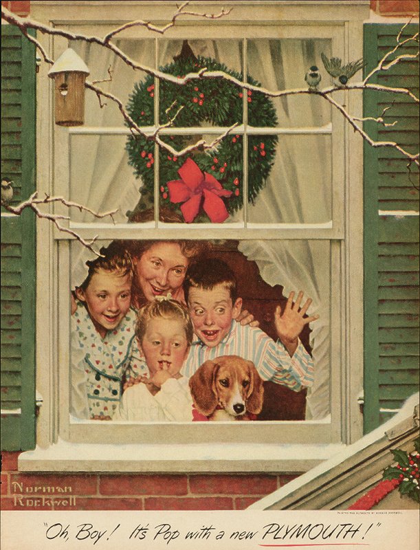
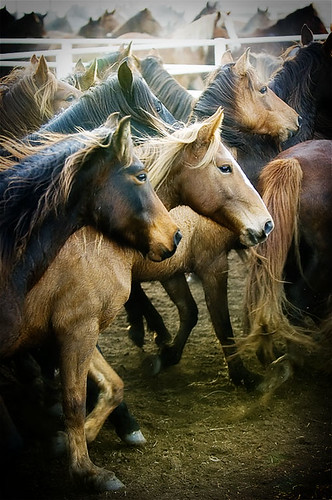
I got completely distracted and found these:
But, of course, I had to get back on task
(thanks, Al Gore for the distraction-tool of the century!).
So... I came upon some of these great ideas:
This is something I did for my News Layout class
last semester... maybe something along those lines?
I like having an animal on my card. I am, after all,
an animal nut. Who knows... I'll think of something at
2am sometime, and wake up my roommate trying
to write it all down. Hopefully that'll be soon!


